Physio Cure
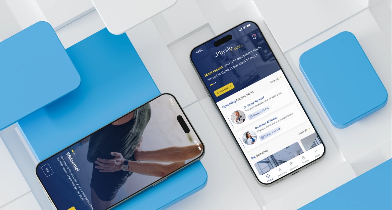
Physio Cure is a mobile app that brings a physiotherapy clinic's booking, records and payments into one place.
The project covered the whole patient journey, from onboarding and login to booking a visit, following a package and paying, drawn on one design system.
- Industry
- Healthcare, physiotherapy
- Services
- UX design, UI design, design system
- Platform
- Mobile app
- Market
- Egypt
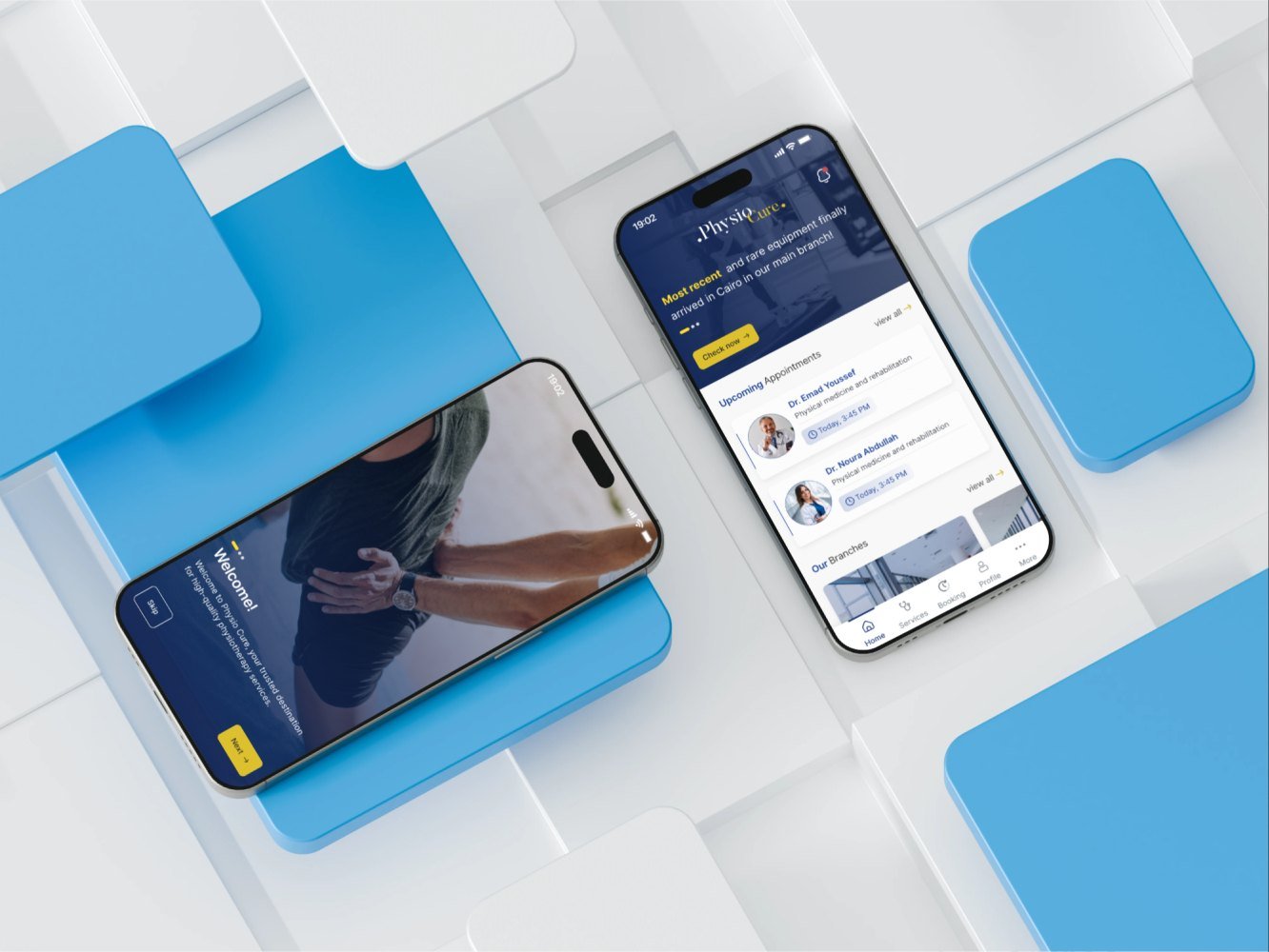
Our task was to design Physio Cure so a patient can book an appointment, follow a package and pay in a few taps, at any of the clinic's branches. The app also had to carry the clinic's content: doctors and specialties, news, educational material and insurance partners. Everything had to feel calm, clear and trustworthy.

One app for booking, records and payments at every branch
Physio Cure is a physiotherapy clinic with several branches across Greater Cairo. The brief was one place for patients to book care, follow their treatment and pay, with the clinic's news and education alongside.
- Request appointments, choose a branch or ask for a home visit
- Book treatment packages and track the sessions left
- Check diagnosis files and appointment history
- Browse doctors and specialties
- Pay online or by cash, with discounts and loyalty points
- Read news, announcements and educational material, and send suggestions or complaints
From requirements to a full prototype
We worked in six steps: requirement discovery, ideation, wireframing, design system, concept design and a full prototype.
-
01
Requirements
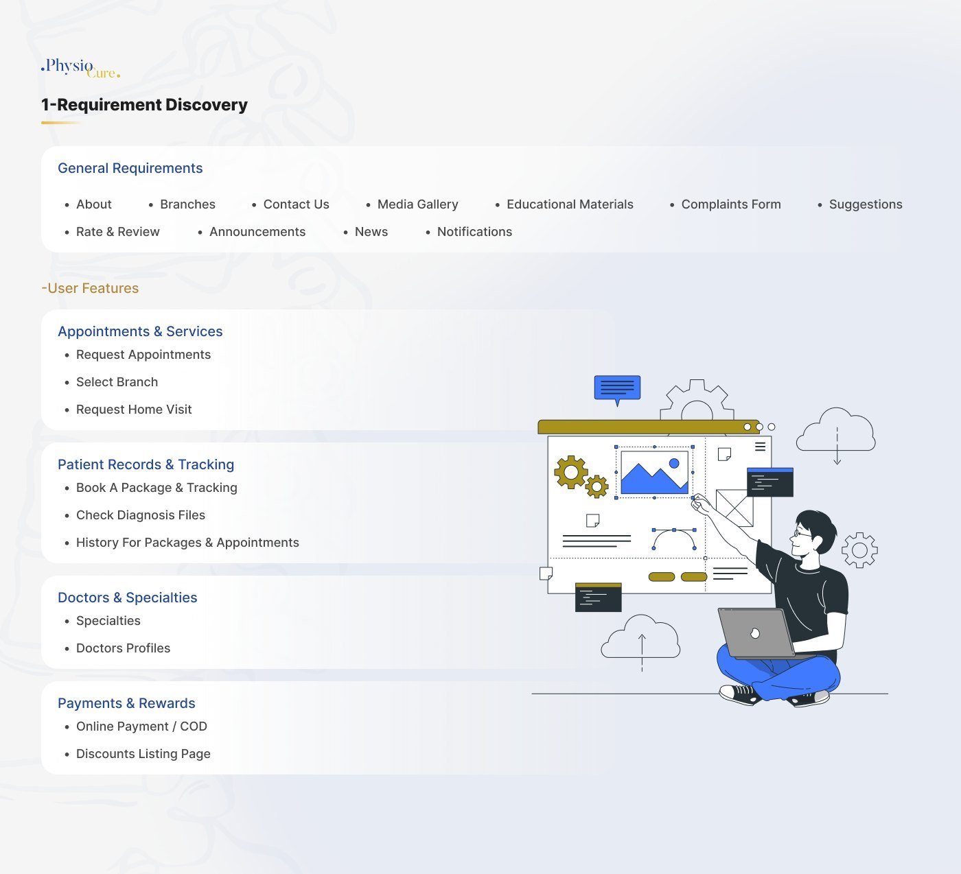
We grouped what the app has to do into general requirements and four user areas.
- Appointments and services
- Patient records and tracking
- Doctors and specialties
- Payments and rewards
-
02
Ideation
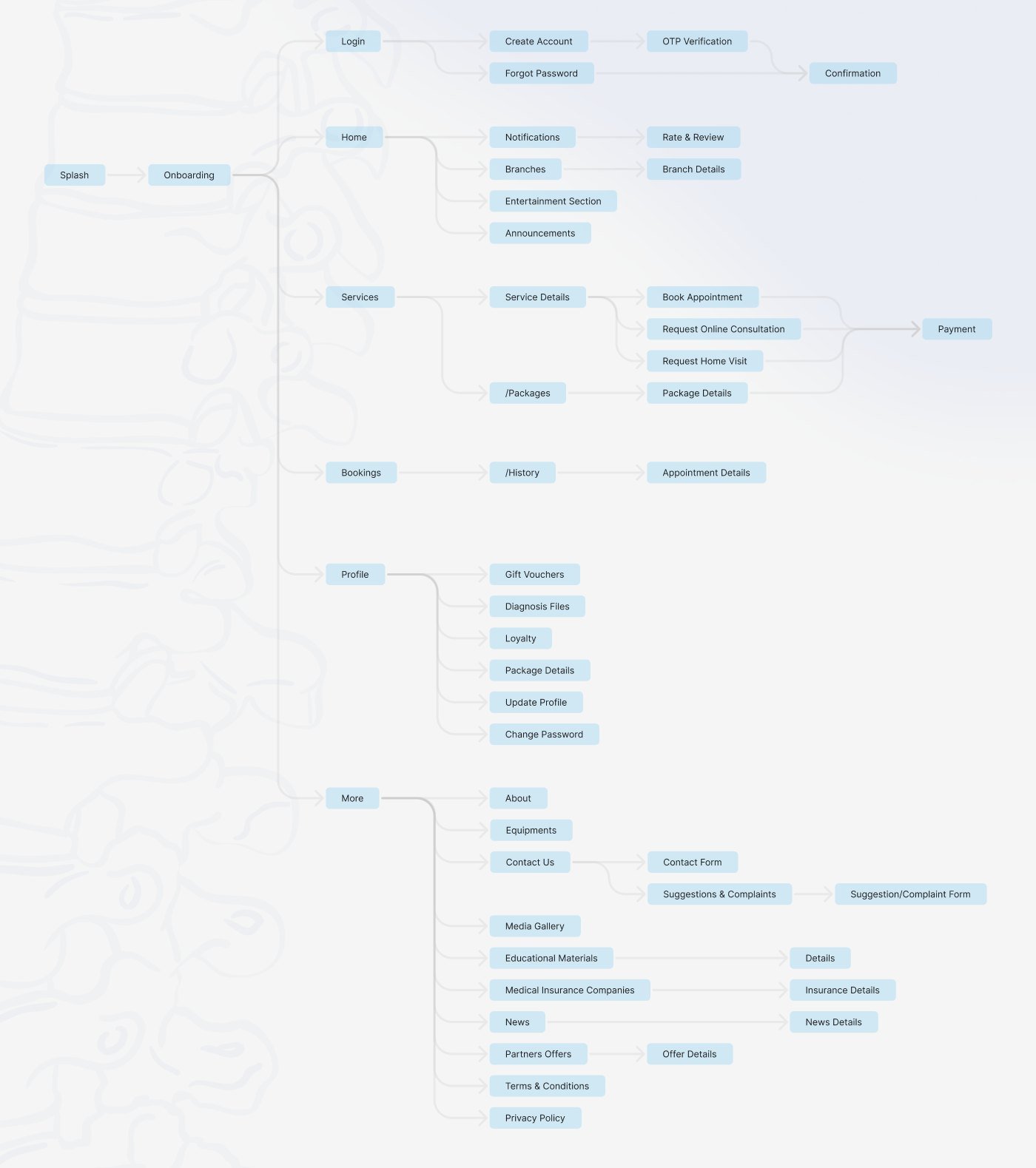
A sitemap mapped every screen, from the splash to the last setting.
- Onboarding and login
- Home, services and bookings
- Profile and loyalty
- More: news, media, insurance, offers
-
03
Wireframes
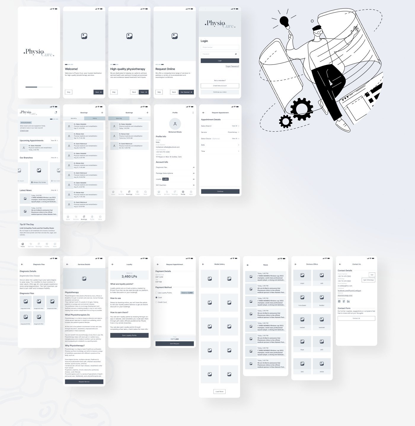
Low-fidelity layouts settled structure and flow before colour.
- Onboarding and login
- Home and bookings
- Request an appointment
- Diagnosis files and loyalty
-
04
UI and system
A concept for the home screen grew into a full mobile UI on one design system.
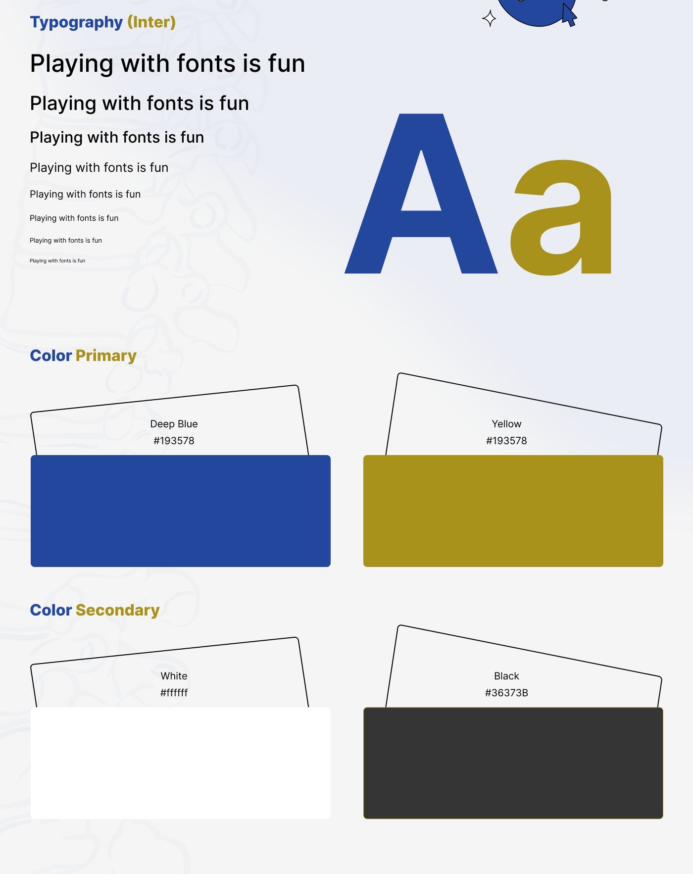
- Type scale in Inter
- Deep blue and yellow
- Home, branches, bookings
- Packages and payment
Book. Track. Pay.
A patient app with its sitemap, wireframes, design system and full prototype.
Mapping every screen before drawing one
The sitemap starts at a splash and onboarding, then splits into login, home, services, bookings, profile and a More menu.
Booking, packages and payment share one path, so a patient reaches payment the same way whether they book a visit, an online consultation or a package.
Settling structure before colour
Low-fidelity wireframes covered onboarding, login, the home screen, bookings and history, the profile, appointment requests, diagnosis files, loyalty points and the content screens: media gallery, news, partner offers and contact.
A calm blue and gold system built on Inter
The interface uses Inter in a small type scale, deep blue and yellow as the primary colours, and white with a soft black as the secondary colours.
Blue carries structure and headings. Yellow marks actions and highlights.
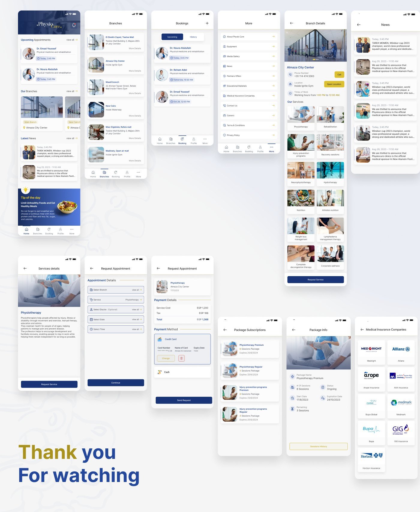
Home, branches, bookings, packages and payment
Home
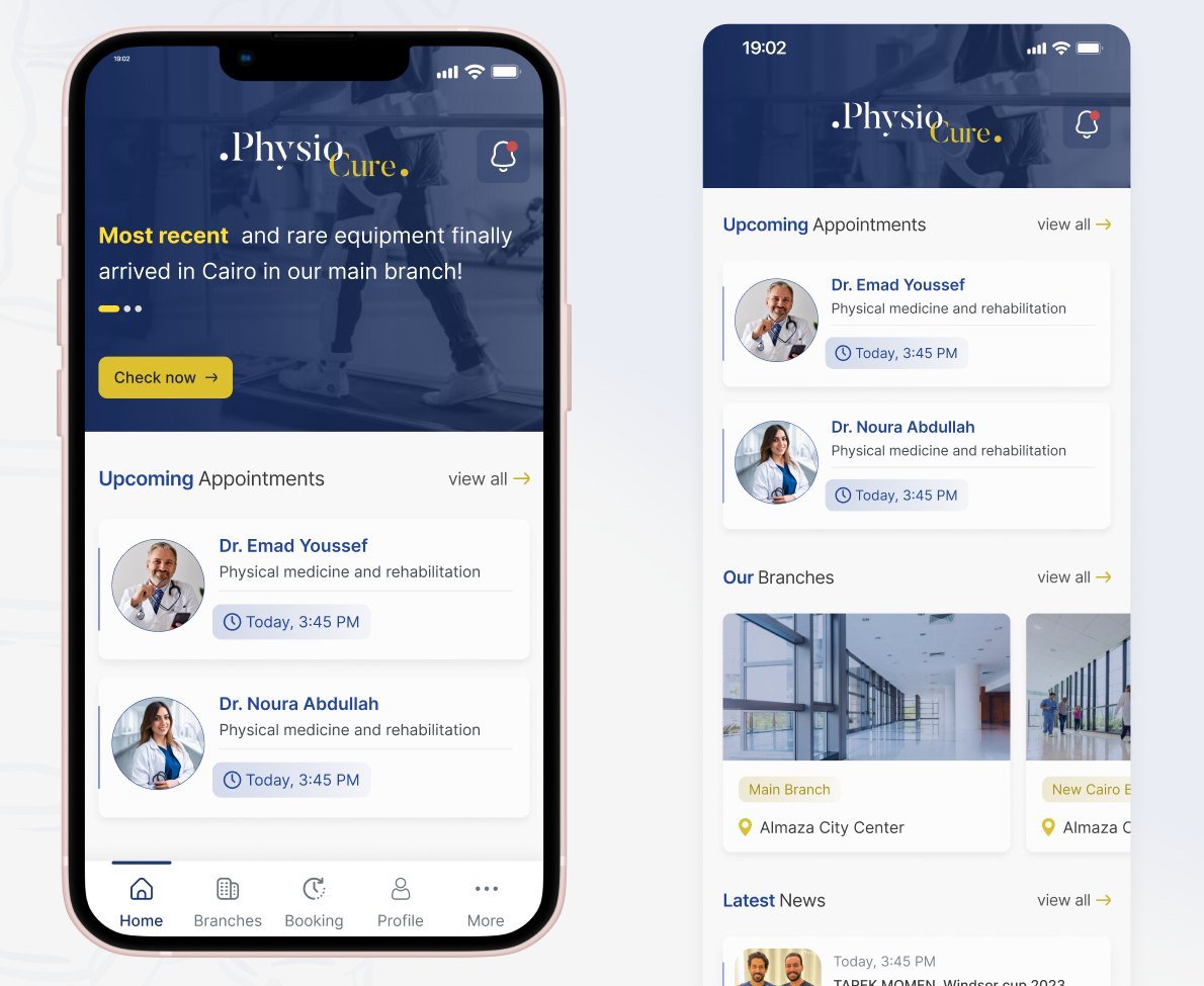
Upcoming appointments, branches and the latest news sit on one screen, with a tip of the day at the end.
Branches and services
Each branch shows its contact details, working hours and the services it offers, with one button to request a service.
Packages and payment
Patients follow package sessions and expiry dates, choose a card or cash, and see the cost and tax before they send a request.
Partners and rewards
Medical insurance companies and partner offers sit in the More tab, and loyalty points live in the profile.