Find Square
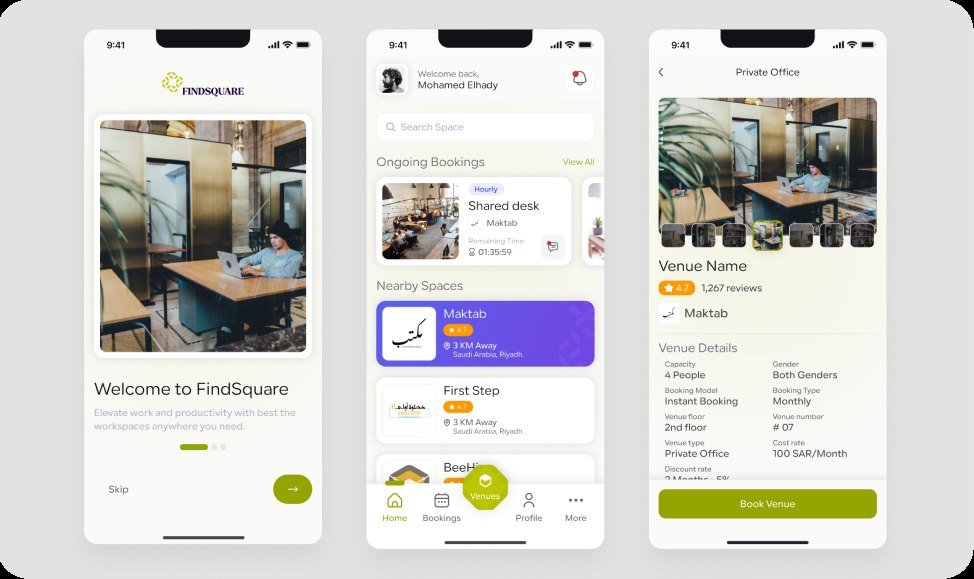
FindSquare is a workspace booking platform that connects venue operators with people who need a place to work.
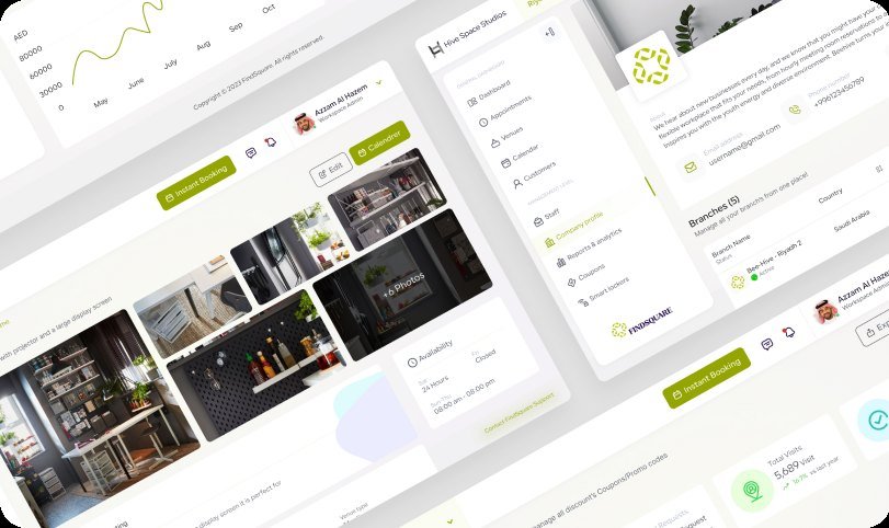
The project covered a mobile app for guests and a web dashboard for operators, both drawn on one design system so booking, managing and reporting feel like one product.
- Industry
- Workspace booking
- Services
- UX design, UI design, design system
- Platforms
- Mobile app, web dashboard
- Market
- Saudi Arabia
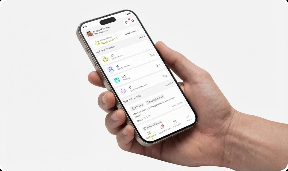
Our task was to design FindSquare so that finding a desk takes a minute and running a venue takes one screen. Guests needed to compare spaces, see availability and book without calling anyone. Operators needed to manage staff, bookings and branches without spreadsheets. Both sides had to feel like the same product.

Booking a workspace felt like a chain of calls and spreadsheets
Everyone wanted the same thing: a quick way to find a space and a calm way to run it. Instead, guests compared venues across messages and listings, and operators confirmed every booking by hand.
- Spaces were compared across messages, listings and calls
- Availability was confirmed manually
- Bookings were tracked in spreadsheets
- Staff and branches had no single view
- Guests and operators used completely different tools
One product for guests and operators
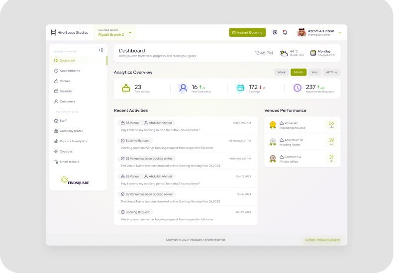
We designed the app around the actions guests take most often, and the dashboard around the tasks operators repeat every day. Both are built from the same components.
- Nearby spaces and live availability in the guest app
- A single Book Venue action at the end of the flow
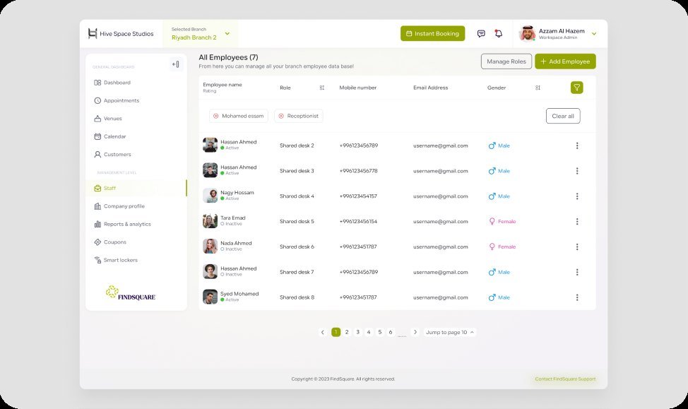
- One table for staff, roles and bookings
- Branch-level views for operators
- Shared components across mobile and web
Cards, clear status and simple actions let people do the next thing without learning a new screen.
How we designed one booking product for two audiences
Before designing the final screens, we studied how guests choose spaces, how operators run them and where the two journeys meet.
-
01
Research
We started with how guests find spaces and how operators run them day to day.
- Operator interviews
- Guest interviews
- Tool and listing review
- Pain point analysis
-
02
Flows
We mapped the two journeys and the data that connects them.
- Guest booking flow
- Operator management flow
- Information architecture
- Data model
-
03
Wireframes
Low-fidelity screens settled the structure before any visual design.
- Mobile and web wireframes
- Navigation patterns
- Usability checks
-
04
UI and system
The approved structure became a polished interface and a shared system.
- Visual design
- Design system
- Interactive prototype
- Developer handover
Book a space. Run a venue.
A mobile app and a web dashboard, built on one design system.
What we learned about how people book workspaces
We looked at how guests choose a space, how operators handle bookings and which tasks they repeat every day.
Guests want availability first
They decide quickly when they can see what is free, where, and for how long.
Operators want one view
Staff, bookings and branches should be reachable without switching tools.
Consistency builds trust
When the app and the dashboard behave the same way, both sides feel in control.
Setup should feel guided
Clear steps and visible status make a new venue or booking easier to complete.
Designing a faster way to find and book a space
The guest app was built around the everyday tasks: checking nearby spaces, comparing details and booking. Each step was designed to feel predictable and quick.
Research, user flows and wireframes shaped a short path from opening the app to a confirmed booking.
Making venue management feel simple
Once the journeys were clear, the dashboard focused on clarity: staff, roles and bookings sit in one table, with the same patterns on every screen.
The visual design uses a clean layout, clear hierarchy and familiar icons, backed by a design system that is documented for developers.
Booking and managing a venue became simpler
Measured numbers can replace these outcomes once the client shares usage data.
One product instead of separate tools
Guests and operators work in connected apps.
A shorter booking path
The guest flow was cut down to the steps that matter: find, check, book.
A system that scales
New venues and features can ship without redrawing the interface.